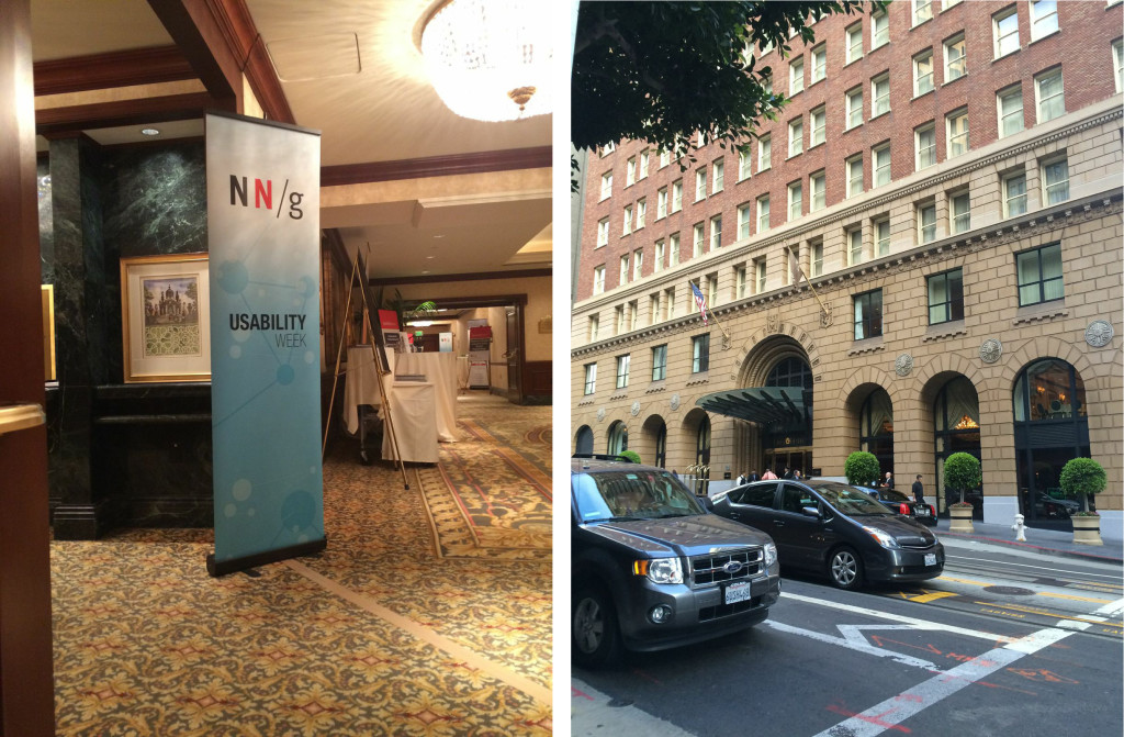
About three weeks ago I left for San Francisco to participate in a UX conference hosted by Nielsen Norman Group called Usability Week at the Omni hotel in the financial district. They describe the event as “all-day, immersive training courses teach practical skills and offer design recommendations that you can apply immediately.” This appealed to me as it gave me freedom to choose exactly which courses that were relevant to me and thus which of the 7 days to attend.
But before diving into the courses, what is Nielsen Norman? If you are a fellow UX:er then you have most definitely head of Jakob Nielsen and Don Norman. If not, well I like to refer to them as “the guys who wrote the book on usability” or “two of the fathers of UX”. Don Norman has an impressive list of contributions to the field of user experience and I can’t even recall how many times I must have quoted him in papers back in school. They were early adopters of interaction methods in digital contexts.
Ok, enough about the old guys! What courses did I attend? Since I have a background in software engineering I chose to learn more about how social psychology plays a part in digital design. And although we are a big team of UX:ers at Aftonbladet, we’re mostly spread out in different teams, so tips for pulling that off is always welcomed. Finally, I like to base decisions on facts and not hunches (the science geek in me loves this) so measure methods go well in my book. So my itinerary looked as following:
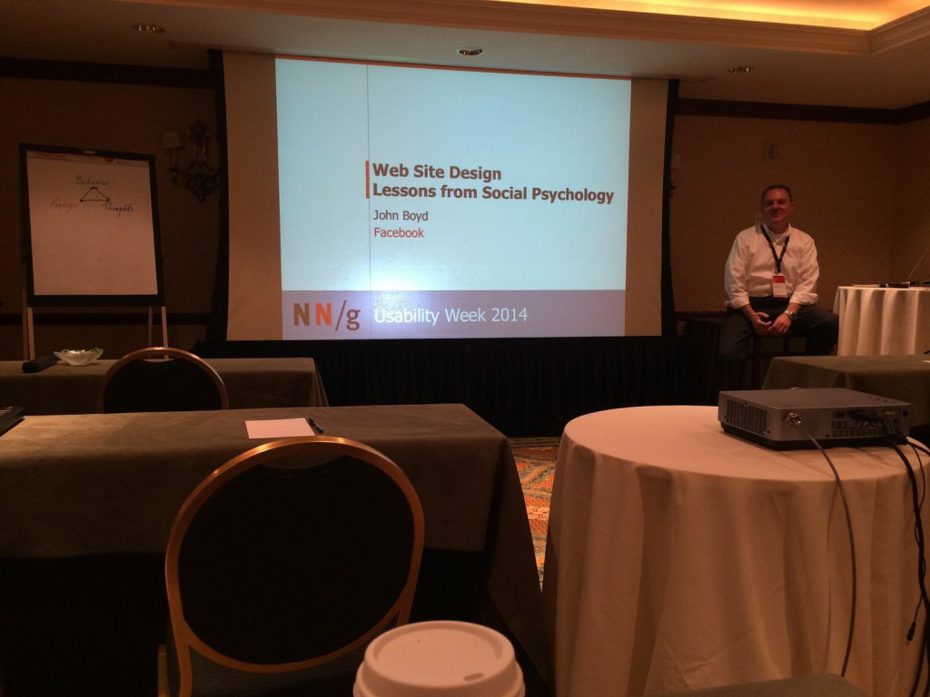
- Website Design Lessons from Social Psychology
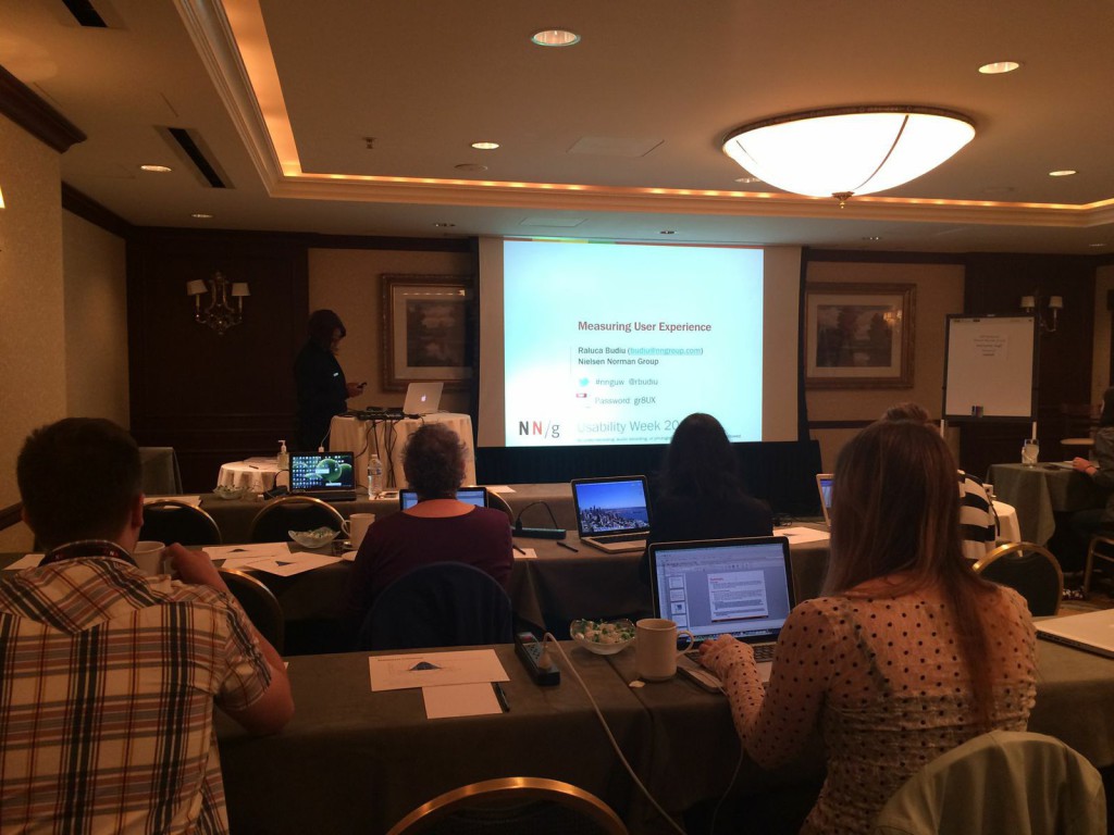
- Measuring User Experience
- The Human Mind and Usability
- The One-Person UX Team Tool Box
It might have sounded cooler with “latest trends in mobile design” or “visual web design” and similar themed talks which they also offered. To any design oriented person this is like candy to kids, but judging from my experience of what NN/g are good at, it is processes, methods and scientific hypotheses. Anyway, design trends are just a google search away on the interwebz…
Some of my many learnings from the courses in a very very condensed bullet list were:
- The power of the situation is immense – Situation and interpretation drives behavior. When explaining our behaviour we understand the situation. But when explaining others’ we don’t. We (UX) must therefore work even harder to put ourself in others’ situation and think about this when we test/observe/draw conclusions.
- A user is a person. We’ll search for shortcuts, have low attention span, be miserly, behave depending on cost vs. reward, be subjects to priming, have limited cognitive ability, etc etc. In other words: We’re complex. So design easy. Not for logic.
- Measuring allows you to describe, assess and compare your designs. And refreshing your knowledge in statistics studies never hurts if you like evaluating design decisions with numbers and facts.
- Give users information/content in form of chunks because that’s how they interact with it. So design for that.
- Multitasking mystique: don’t expect users (especially younger) to focus on one task at the same time. Multitasking doesn’t mean doing tasks at the same time but being awesome at switching between them fast. Consider distractions, errors and inattentional blindness when designing tasks.
- If you, like myself, work with a lot of different projects and try to focus on one per day it can be a good idea to have one hour every day (preferably the last) which you devote to questions which might arise from the other projects. This allows you to adress problems faster and in a structured way. If there are no questions or issues, then learn something or take time to develop that one thing you haven’t had time with.
- Being a UXer in a big company can be like walking in quicksand sometimes, so make the most of your design opportunities; preach UX, plan your project, build allies, be politically savvy and learn to communicate UX. And instead of talking about how good UX will be for the project, just DO it. Show them results.
And so much more that wouldn’t fit here…
Other reflections:
- Meeting other likeminded people from the other side of the world gave a sense of solidarity
- Although we all have the same problems, it’s time we stop complaining and start solving
- The whole event was very well organized and never did I feel unsure of the schedule
- Although they’ve been around for a long time it wouldn’t hur updating their slides. Some slides and examples where from 2008, very outdated feel to it 🙁

I would recommend this event to those who:
- want to deepen their knowledge in well-established processes and methods
- need to refresh their UX-skills
- feel that their hands are tied in their current everyday job and want a push and inspiration
- have different parts within the UX-field they would like to know more about
- are completely new to UX but is intrigued (there are beginner courses for you too!)
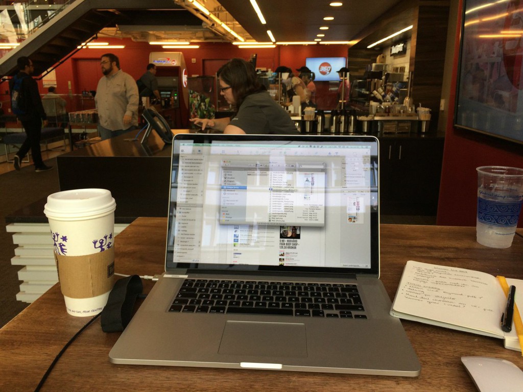
On a totally different note it was fun to just work remotely from internet cafés or friends’s offices while absorbing the buzzing tech vibe that is so very present in SF. I find a lot of inspiration working from different places, meeting different people from different companies and vary my experiences since I believe it challenges the creative mind. And we all know that getting out of your “creative flow” is a lot easier than getting into it. So thumbs up for working in public San Francisco environments along with some almost-Swedish fika!

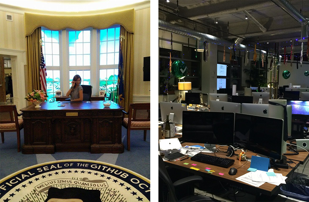
Right: At Dropbox you get balloons on your desk if you’re a new employee
Stay classy, San Francisco!

