We have recently started the process of improving the usability of video-clip pages. In order to get an idea of where Aftonbladet stands compared to other world-class online video/news providers, we conducted an online test answered by 110 visitors of Aftonbladet TV. In this test we compared their perception of an Aftonbladet TV video-clip page to similar pages on BBC, CNN and Youtube.
Research objective:
To compare the user experience of watching and choosing a videoclip on Aftonbladet TV with three international websites that contain video-content (BBC, CNN and Youtube), in order to get input that helps us to improve the design on video clip pages.
Test method:
The test was conducted as on online unmoderated test, created with the tool Userzoom. To reduce the length of the test we randomly assigned one of these websites to each user and asked them to provide feedback on their first impression and how easy it is to choose another video clip to watch.
First impression & finding next clip to watch
Each participant was asked to comment on their first impression of the website after seeing a video clip page for 10 seconds. We also asked users where they would like to click in order to watch another video-clip and how easy they perceive it to be to choose another clip to watch.
Below is a summary of the kind of responses we received for each of these pages:
BBC
First impression
- Busy, too much information (rörigt, för mycket info)
- Structured, easy to navigate (Strukturerad, lättnavigerad)
Besides them reflecting on the structure and amount of information on the page, many participants also reflected on the topic of the videoclip. This indicates that it was easy for them to understand what the video-clip was about, even without watching the actual clip.
We saw a very common behaviour from users when it comes to choosing another clip to watch. Almost everyone chose the next clip from the row above the player.
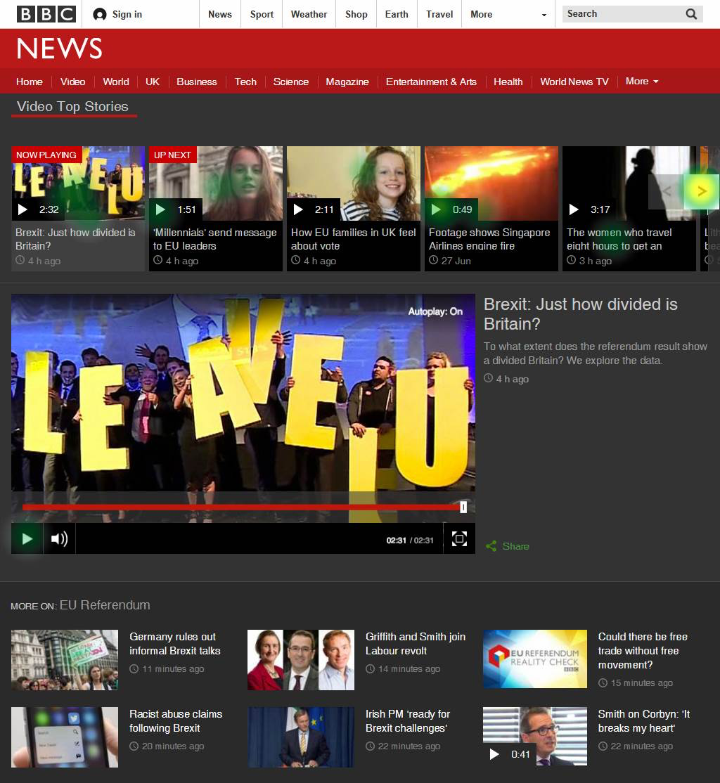
As many participants mentioned that they had a good overview of the content on the BBC page, we can assume that this is why it is relatively easy and intuitive for them to select the next videoclip from this exact area of the page.
Aftonbladet
First impression
- Messy (rörigt)
- Cluttered (plottrigt)
- many boxes (många rutor)
- Many things on the screen (mycket saker på skärmen)
We didn’t see a common pattern in the participants’ behaviour while choosing the next clip to watch. Their choices were spread out among different sections of the page. When asked how easy it was for them to choose another clip, the answer was rather neutral (not overly positive or negative experience).
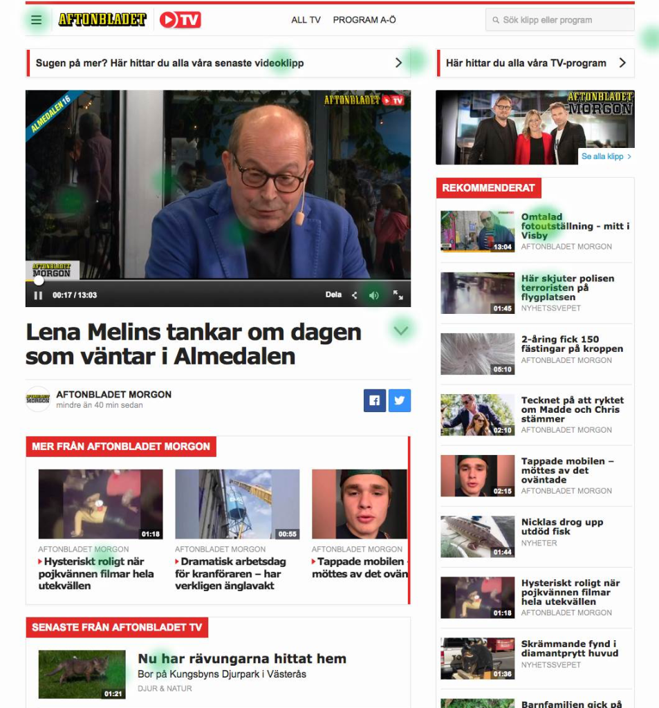
Since many participants commented in previous questions on how they consider there is too much happening on the page, which gives a messy first impression, our hypothesis is that there are many different elements on the page grabbing their attention, which makes it less intuitive to choose the next clip you want to watch.
CNN
First impression
- Messy (rörigt)
- Good overview of the videoclip (bra överblick till videoklippet)
The majority of participants react on how busy/messay the first impression of the site is to them. But some of them also comment on the clean design (ganska ren sajt i övrigt vilket är positivt).
On this page we found a very common behaviour from participants, with almost all of them finding the next clip to watch in the same section below the video player (videos you should watch).
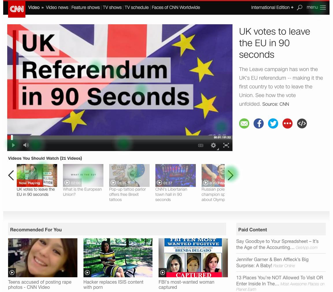
Several participants mentioned before that the page has clearly structured content, which makes it easy for them to navigate. This could also be the reason why most of them choose the next clip from the same area on the page.
Youtube
First impression
- News (nyheter)
- Structured (Välordnat med tydliga funktioner och intressant och attraktivt innehåll)
- Messy (rörigt)
In contrast to the other sites, there are less people commenting on the website looking busy/messy (rörigt). They tend to reflect on the topic (news) and structure of the page more and seem to like it.
The common user behaviour among participants on this page was that almost everyone chose the next clip from the first seven clips in the right column list.
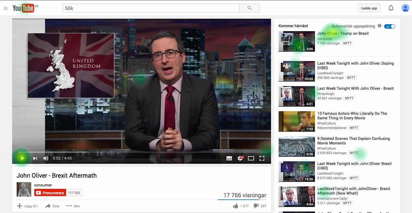
Out of all the pages we tested, participants ranked the ease of choosing another videoclip the highest for Youtube. Our hypothesis is that the limited amount of clips to choose from, and the clear structure of the page, helps participants to choose easily.
What we have learned from this study
This comparison made it clear for us that our video-clip page on Aftonbladet TV website needs a layout improvement. According to users the other websites managed to clearly show the important content first while in Aftonbladet there are so many items that equally grab user’s attention which makes it difficult to choose among.
After comparing these websites with different layouts, we can conclude that it does not matter if we show related content (next videoclip) horizontally or vertically. The most important thing for users seems to be that they get a clear idea on where to find related content, based on a clear and uncluttered layout.
Many participants considered the video clip pages to give a ‘messy’ first impression. This is something that was a consistent response among all the different websites. Which means that we do not have to react that strongly to this feedback, and it is not the main thing we need to focus on for the improvement of the video clip pages.
Next Steps:
Based on our findings from this online test, we have started to redesign the clip page of Aftonbladet TV. At the moment, we are working on a clickable prototype which we’ve planned to conduct actual usability test on (to have users in place and interview them). The insights that we receive by these interviews will help us to improve the usability of the new design iteratively.
As the last step before starting the development process, we will conduct another online test and will ask users to compare the new layout with the one that we already have in Aftonbladet TV website and will see how the new design can actually facilitate the process of choosing other clips to watch one after another.