Improving usability of TV Start Page
This is a story about how by listening to users and monitoring data we’ve aimed to increase the number of clips that users watch in a row while visiting TV section of Aftonbladet. As the UX designer of Aftonbladet TV, I’ve always tried to have a tight collaboration with our Data Analysis Expert and by that mean have a better understanding of users’ real time behaviour.
Digging into user data and finding the problem:
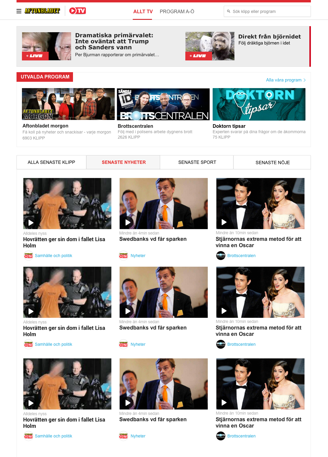
By monitoring data, we found out that one of the pages in Aftonbladet TV with very high bounce rate is TV start page.
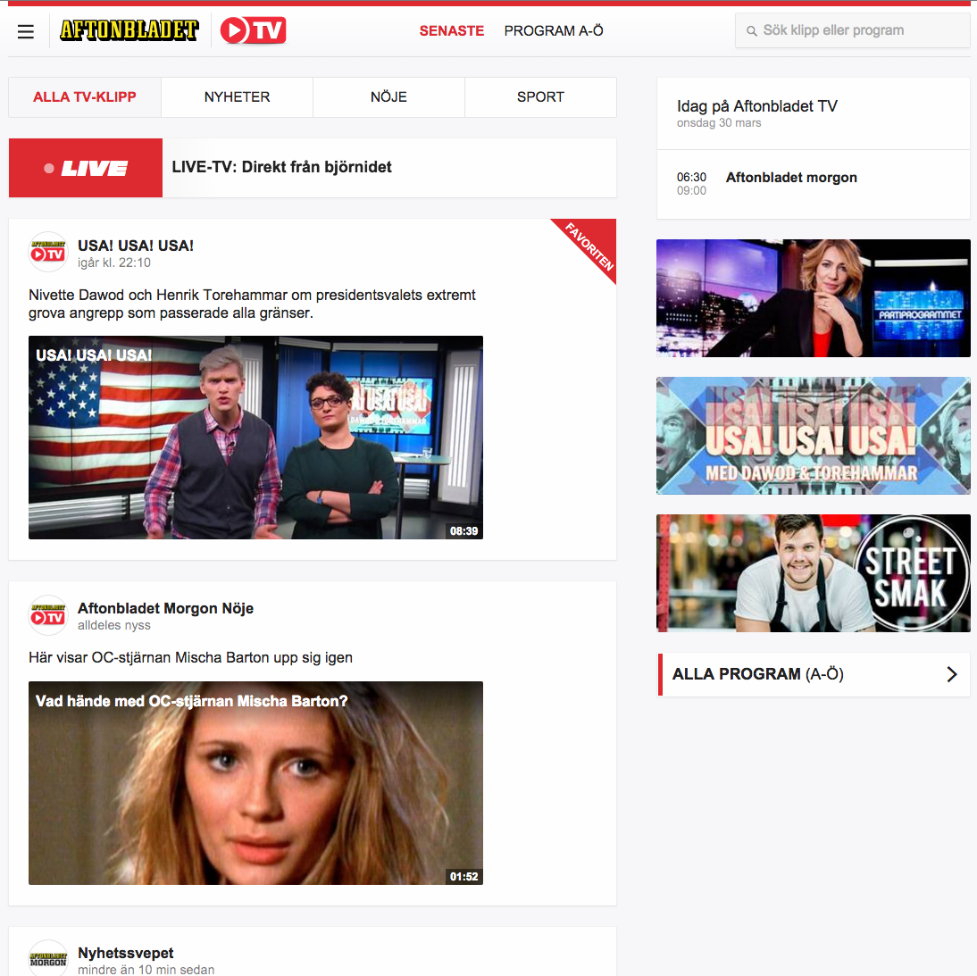
The traffic coming to this page is not that low comparing to the other pages of Aftonbladet TV. Yet only a small amount of users who visit this page, choose a clip to watch. The rest returns back to Aftonbladet and exit the TV section of this site. Knowing the problem, we started to think about how we can keep the users in TV section and motivate them to watch more clips.
A clear picture of what we have now:
As the first step to solve the problem we needed a better picture of the current situation. To gain such picture in no time, I decided to use the following methods:
- Checking users’ scroll and click behavior by

- Guerrilla testing to know user’s first impression on this page
The following image shows the scroll behavior of around 5000 users:
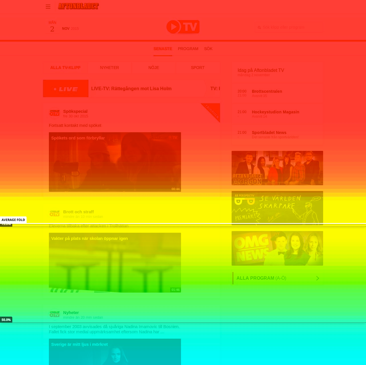
- The average number of clips visible to 100% of the users before scrolling is only one.
- 50% of users scroll down only to the second clip.
- Only less than 25% of users continue scrolling down to the seventh clip.
I’ve also done guerrilla testing (user testing in less than 5 minutes) on 5 users to have a better understanding of what users think about different sections of this page. Some of my findings are as follow:
- To see the live programs, users tried to click on the red rectangle. But it’s not clickable.
- They thought that the images on the right column are ads while they are our promoted programs.
- It wasn’t clear for them why some clips have pink background and some not. Only those who were interested in Sport knew the difference.
- They didn’t notice that the rounded icon before the title of each clip is actually a link to the related program. In fact, they didn’t see this as a separate link to another page than the clip page.
Our hypothesis for solving the problem:
In order to redirect the traffic coming to TV start page to different sections of TV and by that mean increasing the chance of watching more clips by each user, we came up with the following hypothesis:
-
If we show more of our content above the fold and provide more structure to our content then we achieve a better scannability, because the users are able to scan our content quicker and the chance of finding something interesting to watch will be higher.
We also had another idea which was fairly a new concept for the whole Aftonbladet TV. Our hypothesis for coming up with this idea was as follows:
-
If we show the clips related to the “Hot Topics” of the week at the beginning of the start page and make separate pages for all related clips of each hot topic (for example, one separate page for all Oscar clips) we can facilitate content discovery for the users and by that means we can increase the number of clips watched by each user during a visit.
Pen and Paper as the next step:
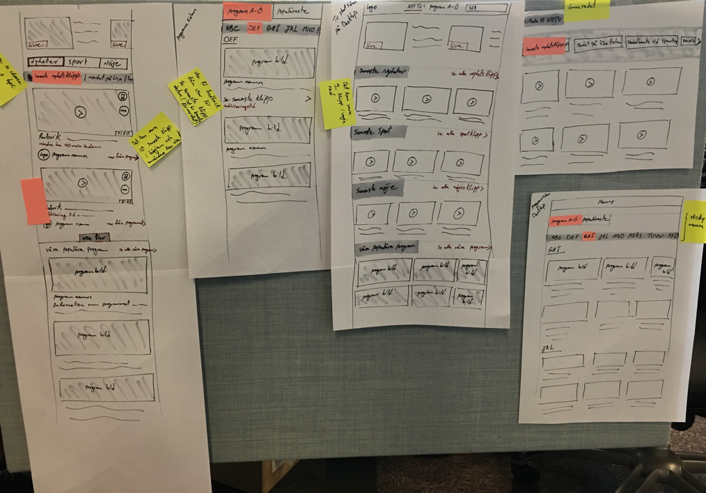
In order to test our two hypotheses we needed to redesign the start page as well as to add some new pages for testing the second hypothesis. I started the work by wireframing the new layout using my very best friends: Pen and Paper!
Here are some screenshots of my paper wireframes:
Then I turned my paper wireframes to actual design using Sketch. In order to test my design I made a clickable prototype using Invision from the wireframes that I designed earlier. Here is a movie that shows how this clickable prototype works:
User testing and findings:
I tested this prototype with 6 people. Each test took around 30 minutes long and it turned out that the labeling of the top section of start page is the major problem of this design. Some of my findings are as follows:
- They didn’t see any difference between Top News (Top Nyheter) and Latest News (Senaste Nyheter).
- Favorite (Favoriten): they asked whose favorite is it, it is their favorite, staff’s favorite or other users’ favorite?
- Latest program (Senaste Program): They didn’t find any logic behind promoting the latest clip of a program yet calling it latest program.
- They didn’t like the placing of the promoted programs at the bottom of the page. They mentioned that they do not usually scroll down this far and there is a risk that they never see the promoted programs.
- The layout of the rest of the page was fairly clear to them. They liked the simplicity and ease of navigation on sections related to Senaste Nyheter, Senaste Sport, Senaste Nöje.
Second Iteration:
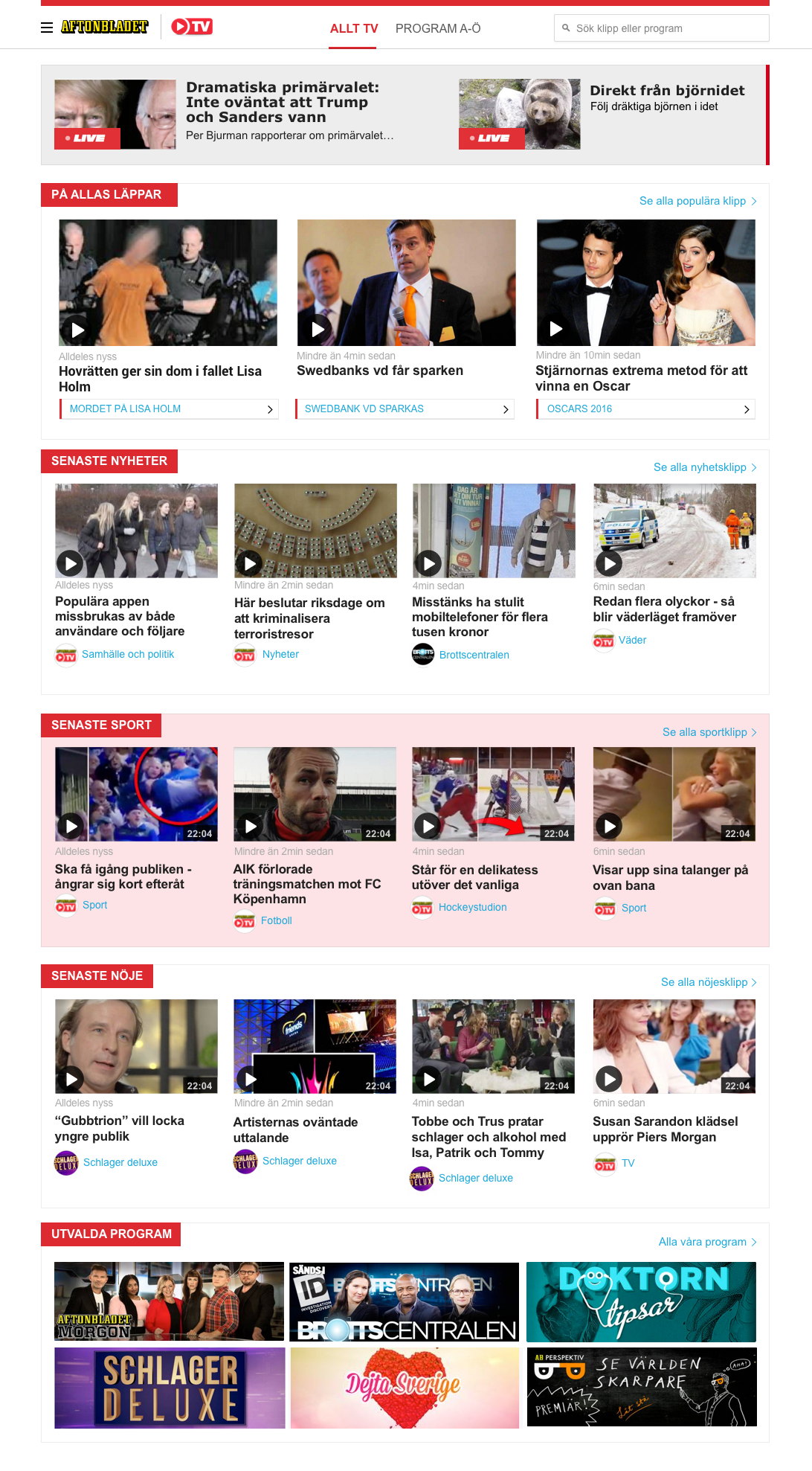
Based on users’ feedback I modified the design and the result is as follows:
I tested the second design with 6 people (each test took around 30 minutes) and the result is as follow:
- What Sweden talks about (På Allas Läppar) wasn’t something that they wanted to see at the top of the page. They understood the concept, however they prefered to see the latest news or sport clips at the top first.
- Those who were mostly interested in entertainment clips (Senaste Nöje) wanted to have a way to see those clips first. They didn’t like to scroll down this much to find the topic that they were interested in.
Third Iteration:
Based on the inputs that I received during user testing sessions of the second iteration, I modified the design one more time and tested it with 4 people. Here is the modified design:
Killing my darlings:
As designers, we always try not to fall in love with our ideas and to be able to kill our darlings (favorite ideas) whenever we feel that it’s not a success. That’s why I totally removed the section dedicated to the “Hot Topics” since the result of user testing showed that it is not something that users look for on this page.
One step towards personalising the page:
During user testings I found out that those users that are interested in latest entertaining clips (Senaste Nöje) want to see these clips first above anything else. To satisfy such need of our users we decided to get help from cookies and save the category each user chooses to watch and have that category as chosen for the next time she comes to this page.
The new layout received very good feedback from users. They didn’t find anything vague about this new layout and when I asked them to compare it with the current layout (The one that we actually have on the website right now) they all liked the new design way better. So it seems like we are in a step where we can actually start developing the new design. I’ve already handed over the new design to our back-end and front-end developers to start building it for real.
Next step, Back to the beginning:
Monitoring data is the beginning and the end of this story. By keeping an eye on users’ behaviour in real time we can find out if we need to change something. However, what to change and how to change it is something that we need to come into by the help of user testing. In fact, it is only based on users’ feedback that we can decide which direction to follow and what to do next.
So next step for me, will be tracking users’ behaviour after releasing the new design on the site. So stay tuned and I’ll keep you posted about the results and our new design decisions based on actual feedbacks that we receive during further user tests.